Design at scale in a financial institution
A story about patience and drive: when a team works together in an organized way, great products happen.
role
Design systems lead
company
Emirates NBD Bank Dubai, UAE
Year
2018–2019
This case study is about a multi-brand and multi-platform Design System for Emirates NBD Bank, the leading bank in the Middle East region. I was a pioneer member of the in-house Design Team of the bank. When I joined, the product experience between mobile and desktop banking was broken and there was no single source of truth for any design.
As Design Systems Lead, I wore multiple hats along the journey. From the initial strategy, buy-in, production, adoption, and support of Compass, the first Design System of the bank. In the process, I also became the Design Systems evangelist in the organization by actively communicating, educating, and showing stakeholders and team members the value and benefits of having a Design System.
The Journey of compass
Creating a solid foundation
The redesign of the mobile and online banking was the perfect opportunity to build the V1 of the Design System with accessibility, scalability, and modularity in place.
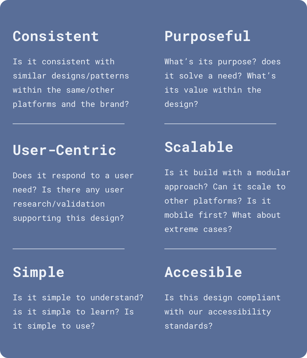
In collaboration with visual and product designers, marketing, and the product owner, we crafted the design principles for Compass, our Design System.
Defining the visual foundation was the next step: enter color palette, text styles, and icon styles.
Design Tokens
The power of consistency at scale
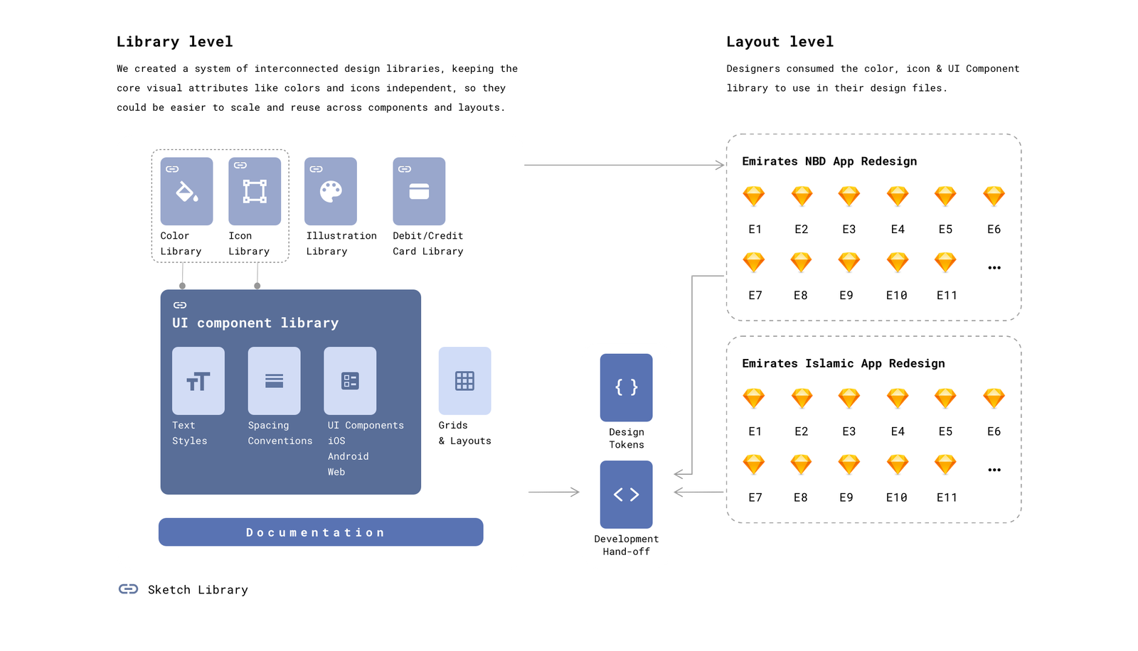
How to ensure consistency in an evolving project, with scalability & flexibility in mind (and ALL at the same time?) Enter design tokens! After multiple proofs of concept and a lot of communication and evangelization, I got the buy-in from the tech team to use design tokens at the core of our design system process. We used the super awesome and well-documented Style Dictionary to convert our visual properties into code for the different platforms (iOS, Android & Web).
How did the tokens look on the design side?
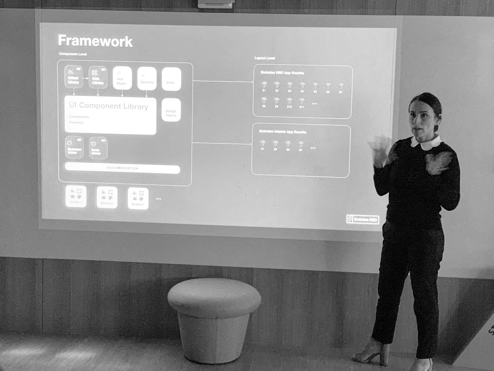
The framework below highlights how I organized our foundation libraries (colour & icons) and the UI libraries with Web, iOS, and Android components.
This way of working allowed designers to consume the foundational elements in all parts of the experience. Other libraries contained our UI illustrations and one with the Bank Cards assets in a modular way, so the team could consume them and adjust them as it was needed for the different platforms.
The design system-level on the left had its own process to encapsulate the tokens in a JSON file for developers (text sizes, spacing, colours and elevation), which ensured that whenever we needed a change or adjustment, it was documented and updated in design and code.
Collaboration & documentation
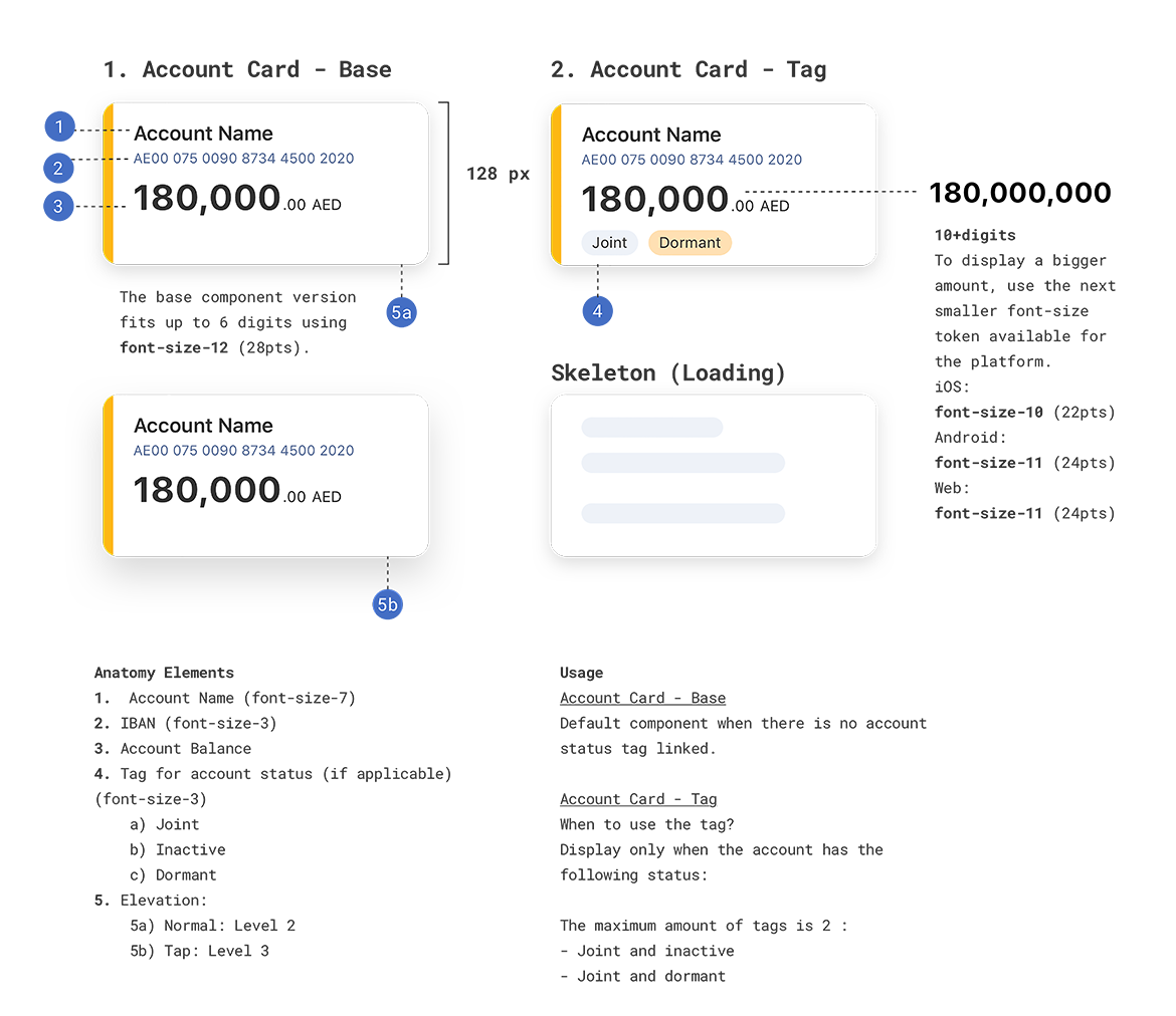
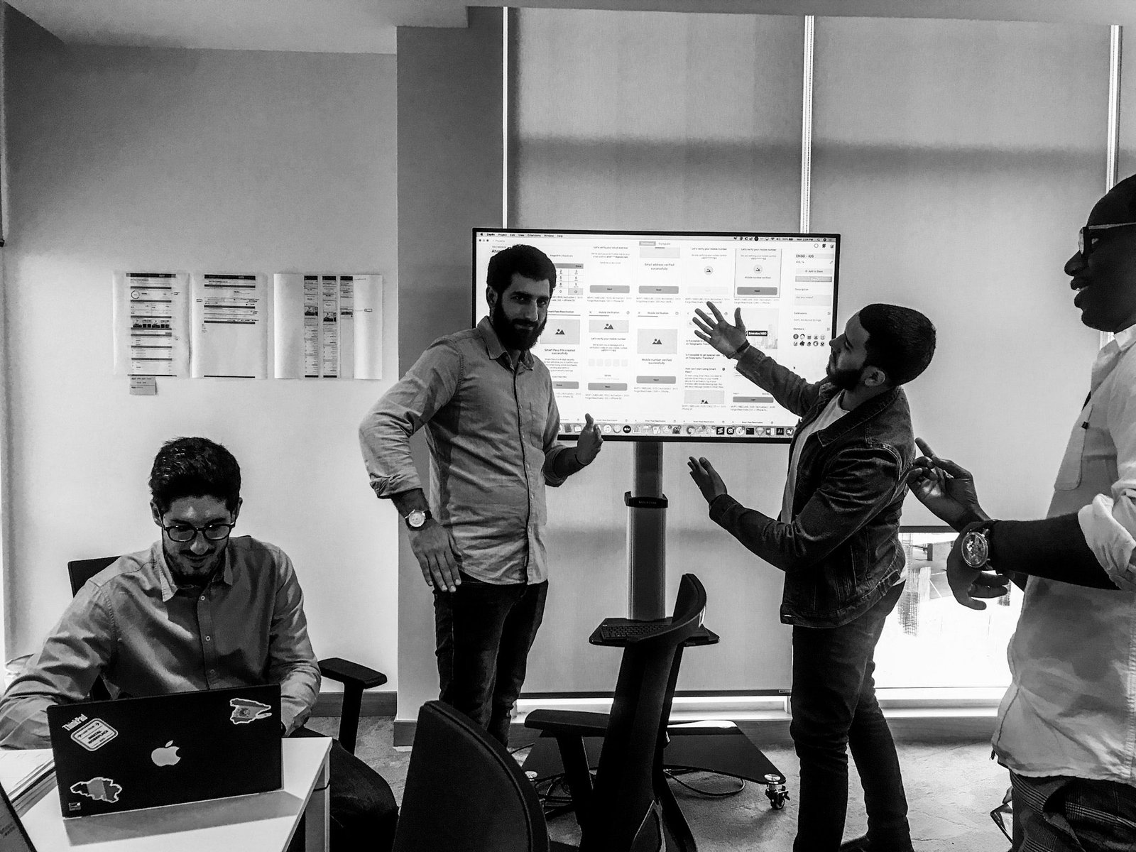
I worked closely with iOS, Android and Web developers dedicated to the Design System to make sure the components followed our design guidelines and the naming conventions were aligned. Every component was documented to include design tokens, use cases and anatomy elements.
benefits
1. Sharing the same token language
In only four months, we improved communication between developers and designers, leading to more productive conversations. We used design tokens as the source of visual truth, and they helped the team to abstract design feedback in quality assurance sessions. Now we talked using token names instead of hex codes.
One example that showed the power of the Design System using tokens was when we decided to change the color of the primary text after our usability testing. What could have been a nightmare for designers and developers, took only minutes to fix across iOS, Android and Web platforms. Plus, since we were working with a library of color and text styles, the change in design was also seamless.
2. New ways of working
By separating tokens, components, and design layouts, developers and designers were more focused on doing their work. Designers and developers were aligned, the experience was consistent, and the squad's speed of delivery increased.
In only a few months, every member of the team became an ambassador of the Design System: Developers, Designers, Scrum Masters, and Product Owners began to see everything in components. There was no going back.
3. Ready to cook
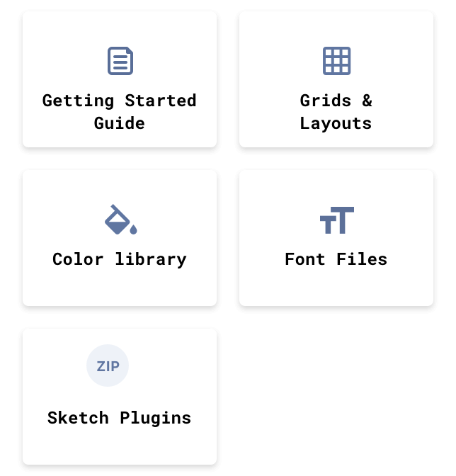
I empowered new designers and collaborators by creating a package with onboarding materials, from naming conventions, where to find the libraries, layouts, and everything that they might need to ensure quality following our new standards with independence and consistency.
the human component
Sharing is caring
To support the awareness and adoption of the Design System I held weekly sessions with designers and invited developers, to listen to their concerns and help them to see how the Design System could help them and support their design decisions.
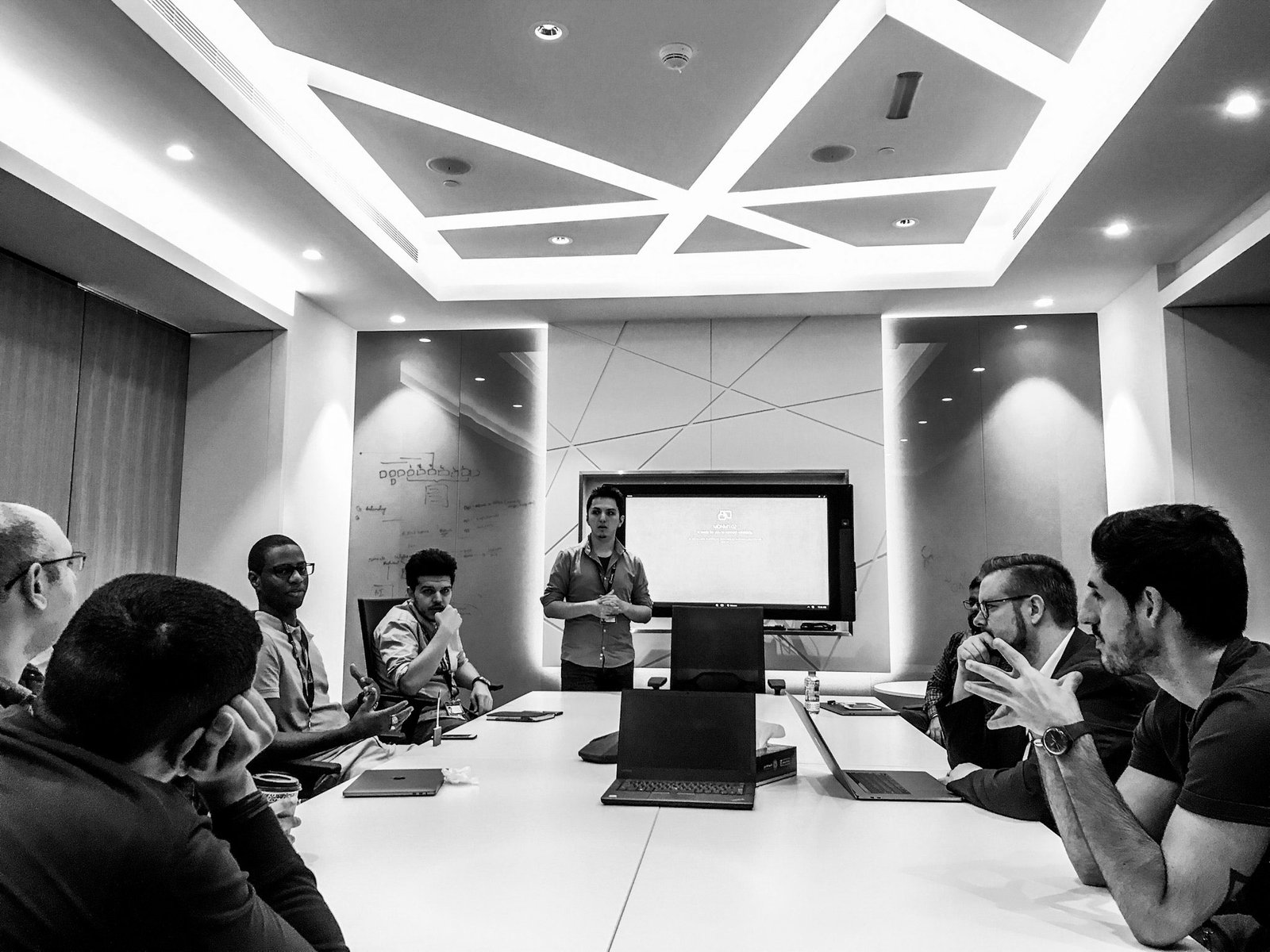
Design System Session.
A frontend developer sharing his experience with the Design System.
testimonials
They said it, not me!
Before the V2 of the Design System, I gathered feedback from the team about their experience. I set up interviews with the developers and designers to know more in detail about any challenges or improvements we could introduce as part of the Design System. They also shared examples of how it has helped them in their day-to-day work.
“It’s easy for designers and it has saved me time figuring out styles and what I need to do my work. It took me like three days to understand everything.”
– UI Designer
“Excellent! It has been very helpful. We only apply changes on the component and it will reflect throughout the application. It removes manual work.”
– Web Front-End Developer
“Reusability is good for efficiency; we have separated developers for screens and components. So the devs working on screens can move forward while I work with the UI Components.”
– ios front-end developer
“The Design System has given designers and developers a shared language. We are building a bridge between designers and developers.”
– android Front-End Developer
Walk the talk.
Evangelizing, presenting, and getting people excited about the Design System and our journey.
results
What success looks like
Increased by 70% the speed of design and development
With our Design System in place, the teams using it designed and delivered at a faster and more stable cadence. This reduced costs and production time for the bank.
Quicker onboarding for designers
The team grew from 3 designers to 12 over five months. Having documentation and a starter kit in place increased the efficiency of the designers in the team.
Minimal effort with a ripple effect
The vision for the Design System was for it to be a solid foundation for multiple digital products and brands in the organization. And also allow other brands to showcase their identity and personality.
For example, to redesign the mobile and online banking experience of a sister bank in the group, we adjusted the color tokens in the Design System with minimal design and delivery effort.
A lot of work, but also, a lot of fun times with the Design System!
From left: Daniel (Sr. Visual Designer), Fadi (UX Designer), Amin (Visual Designer), Batsi (Sr. Interaction Designer)
Learnings
Design systems are about people
Change is never easy, and to support adoption and changing behaviors, it is critical to engage with your team, early and often. Listen to their needs, make decisions that are scalable and communicate, communicate, communicate!
The Marie Kondo of Design
My top takeaway from this project in the almost 2 years that it was my full-time job, is knowing first-hand that all the work and patience was worth it. The Design System truly helped my colleagues to do their work better and in a more organized and scalable way. That sparks joy :)
Pushing the bar higher
I am happy to have contributed to creating a standard in a big organization. The Design System helped to bring the design practice along with the user experience to a new level. This couldn’t have been possible without the awesome group of designers and developers who believed it was possible.
Get inspired & embrace your style
There are fantastic design systems out there, and it’s good to have them as references, but it’s also valuable to not minimize the work that you and your team are doing. In the end, every design team is facing different challenges. Embrace your own and find a way to make it work for your team.
Let’s work together
I’m open to collaborations with fun & friendly people. If you’re looking for someone to partner with for branding, design or illustration projects, contact me.